It can be more than daunting when deciding to redecorate your home. So much to think about. How to position your furniture whilst keeping good Feng Shui. What interior design aesthetic are you going for? Is it a modern farmhouse? Steampunk? Eclectic chic? Minimalism? Then trying to think about a colour scheme. It’s a lot. But don’t worry, we have compiled a simple guide to help you navigate the colour wheel like a pro!
Let’s start off with a simple rule that anyone can follow, whatever your design tastes. Used by all visual artists from graphic designers to interior stylists;
The rule of 60/30/10.
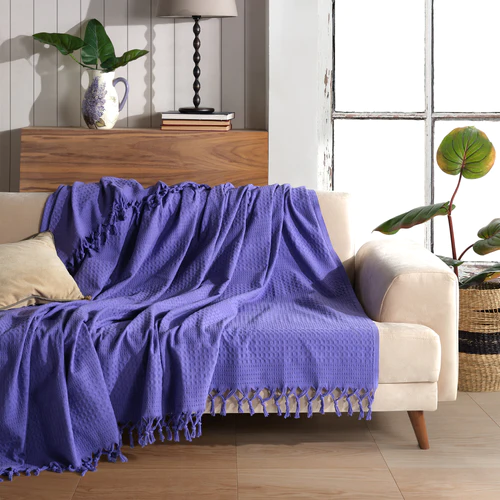
The rule of 60/30/10 is the ratio or proportions you decorate a room. 60% should be your chosen dominant colour, then 30% a secondary colour and 10% should be a bolder colour for accented pieces around the room. For example; you could choose to paint 60% of your room with a non-offensive magnolia, then 30% in natural brown colours. This could be a leather sofa, wooden tables, flooring, or beams. Finally, your accent pieces add a splash of color, this could be a periwinkle blue sofa throw. Such as, our three-layered boho muslin throws completed with light blue ornaments scattered around, a side lamp or a fresh flower display on your mantel.
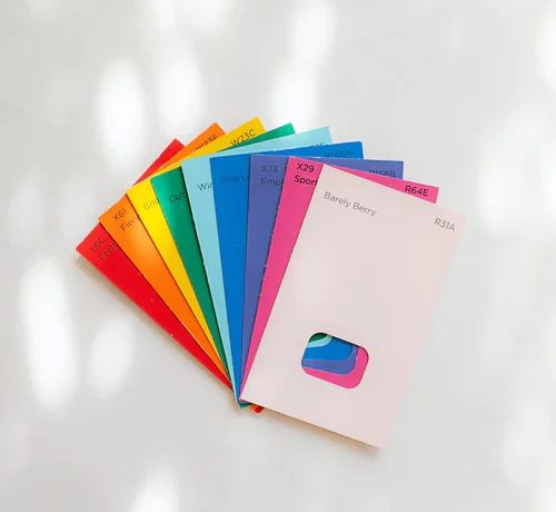
What is a colour wheel?
The colour wheel was invented in 1666 by Isaac Newton, who mapped the whole colour spectrum onto a circle. It is still being used today by artists and designers all around the world. You can find colour wheels everywhere by searching online.
Here are three examples of colour scheme choices that everyone should know.
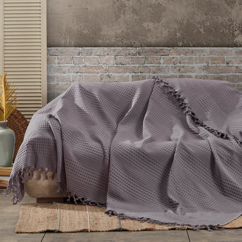
Monochromatic. Which is choosing your primary base colour, such as winter grey. Then pick your secondary and accented colours from the same section in the colour wheel but a different shade, ranging from dark to light. For example, a darker slate grey like our anthracite herringbone blanket at the bottom of the bed, using it as a bed runner matched with our white waffle throw to cover the entire bed as a bedspread.
Complementary. Which is picking colours from the opposite sides of the colour wheel. Orange and blue are opposites, and so are purple and yellow. Remember to stick to the 60/30/10 rule and you won’t go overboard. Picking from the opposite sides of the colour wheel gives you high contrast and high impact, while at the same time creating harmony. Check our full sofa throw catalogue to see our vast range of versatile colour options and start mixing and matching yours today. Our dark mustard waffle throw can cover a 3-4 seater sofa, then add accents of blue. Scatter cushions for example or folding and layering of our blue muslin blankets will look amazing but also add depth and intrigue.
Analogous. Pick your colours from right next to each other on the colour wheel, green, blue and yellow or blue, violet and magenta. Again it is very important to stick to the 60/30/10 role for this one. Our Geometric patterned winter grey blanket has flecks of light blue and cream mixed in it, so matching it with the off white herringbone throw will add to your cohesive colour palette concept.
What do your colour picks say about you?
The colours we are drawn to as individuals can say a lot about us as a person. Purple represents creativity and nobility. Bright blues such as navy or royal, represent confidence and success, whereas light blues are calm and tranquil. This is what it says about our personality but how can these affect our mood and emotions?
Colour psychology tells us of the importance of colours on our psyche. The limbic system in our brain is responsible for recognizing colours. In fact, we see colour before we see shapes and textures. The limbic system is also responsible for dictating our emotional reactions and behaviours too.
Personalities that are passionate, incisive and warm will be drawn to Red but using the colour for an entire room can actually increase your heart rate as red represents the body and physicality. Blue affects your mind, using lighter shades can clear your mind and allow you to think without distractions. Yellow represents your energy level. Using little touches can lift your mood and energize you for the day, but using too much can make you anxious. In fact, studies have shown that more arguments take place in heavily yellow rooms.
So it is all about balance, little touches of colour in the right proportions can affect how we live, feel and behave. Experimenting with little accented pieces will bring a room together but also draw your eye to specific places. Chair throws for armchairs and sofas are a great shout as well as knitted blankets or natural cotton throws for beds. Bed covers for king size beds are difficult to find, thankfully we have a massive range of sizes, textures and most importantly colours to choose from!