What is a ‘Colour Of The Year’?
Since 2000 Pantone has picked one colour each year to represent the feelings and movements of the world’s companies and people.
The limited company was actually founded in the 1950s as a paint mixing company by two brothers. With their roots in the advertising world, they knew the importance of colour on the human psyche. Over the years they have become the leader in cataloging and providing a colour matching system for artists, graphic designers, marketing and advertising companies to use in their strategies, to stay up to date on trends while using it in their branding, and boosting sales.
This year Pantone’s ‘colour expert’ took stock of what was going on globally, once again looking at advertising, social media trends, cultural changes, film and TV as well as movements in the tech world. Reflecting these unprecedented times, Pantone for the first time, chose to create a brand new colour, rather than an already existing one; hence ‘Very Peri’ was born!
What characteristics does Very Peri possess?
The hue is described as a ‘vibrant shade of periwinkle blue with energizing violet-red undertones’ –
This exciting new colour is representative of the transformation we have all undergone. How humanity perseveres in the face of adversity and in a quickly changing landscape.
We now break free from isolation and uncertainty, tentatively taking our first steps out in search of a fresh start.
Colour psychology tells us of the effects of blue on our mood, giving a calming tranquil presence while invoking confidence and professionalism. More specifically Periwinkle blue gives us a sense of optimism and hope. When you add that splash of violet-red it emboldens us with energy and creativity ready for whatever 2022 throws at us!
‘It embodies a courageous presence and encourages personal inventiveness and creativity.’
How can Very Peri fit into our home and interior aesthetic?
This Violet purple hue is fabulous for decorating your home! It is not overbearing in an interior setting, yet when used right, it still manages to pack a fresh and dramatic punch.
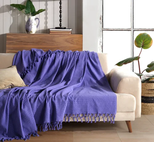
At Milam London, we pride ourselves on being a home for unique designs. We feel it is important to stay tuned to changing trends and this is why we commissioned our luxuriously soft and elegant cotton waffle throws in, that’s right! Very Peri!
Chuck it over your sofa to give a fresh modern feel to your home. Its calming and restful influence from its blue undertone is the perfect atmosphere for a living room or bedroom.
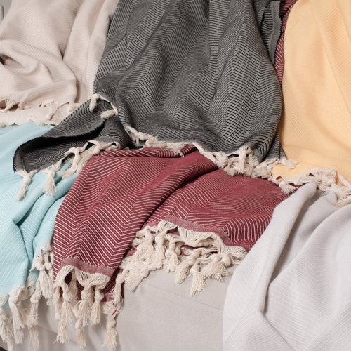
Try mixing and matching accessories in the colours that make up very peri. For example, A pink scatter cousin with a periwinkle blue one will work in utter harmony with a Very Peri throw.
If you would like to know more about how colour psychology works and how to implement it in your home read our blog on ‘’How to use colours in your interior design and what it says about your character.”